NY.GOV ID - Create a New Account Flow Redesign

Overview
Product Description
NY.GOV ID is an online account that allows New York State residents, businesses, and employees to securely access government services. It is used for everything from regular tasks such as renewing a car registration to services accessed during major life events such as unemployment. Agencies throughout New York State utilize NY.GOV ID to provide services to residents and state employees.
Improving the User Experience
Since millions of residents throughout New York State need to use NY.GOV ID to complete important tasks, it is necessary that it is both accessible and usable. Various issues related to accessibility, organization, and ease of use appeared during testing of the NY.GOV ID system, therefore it was determined that it is necessary for the system to be improved. The NYS UX team was tasked with one of the first revamping projects; improving the create an account flow.
My Roles:
UX Design, UI Design, Wireframing, Prototyping
Tools Used:
Lucidspark, UXPin
Design Process
Discovery
Since NY.GOV ID was already a developed product, going through the current flow was the first step in figuring out what needed to be addressed. Screenshots were taken of the screens and pasted into a Lucidspark board to review. It was discovered that the flow title, the lack of a clear primary button, confusing username requirements, and lack of grouping among the input fields created a lackluster experience. In addition to this, the number of steps displayed in the stepper did not properly reflect the actually number of steps within the flow, which could create confusion as there were no tasks to complete on the final screen of the flow.
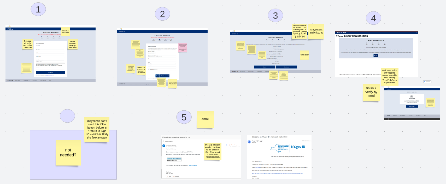
Making Changes
Using a mobile first approach, the UX team began redesigning the screens using the current framework as a guide as to keep any technical limitations in mind. Information about NY.GOV IDs privacy policy was added to the first page of the flow to make it easier for users to find and the number of steps was reduced to three to better reflect the amount of steps a resident actually goes through within NY.GOV ID. Primary buttons were displayed first and have different styling from the secondary buttons. In addition to this, since majority of the fields within the flow are required, it was decided that it would be more useful to indicate whether a field was optional or not. The username requirements were removed from the screen and only appear via validation messaging when the chosen username did not meet requirements.
Mockups
Account Information Screen
On the account information screen, a blurb about the privacy policy was added, asterisks were removed from required fields, optional fields were tagged, and username information was removed. The button styling was also changed to look more modern.


Personal Information Screen
On the personal information screen, residential address label was changed to street address & the grouping of the fields is now titled as residential address. The primary button is now displayed above the secondary button and they now have distinct styling. The language on the primary button was changed to “continue“ as the account is not fully created until the information is reviewed & verified.


Review Information Screen
On the review information screen, the instructions were simplified, username was brought to the top, and the groupings of information was made a bit clearer. The primary button was changed from “continue“ to “create account“ as this is the last step directly within NY.GOV ID to set the account up.


Check Inbox Prompt Screen
The team was made aware that there was another screen that needed review. Users would need to check their emails for a link to finish setting up their accounts. For the check inbox screen a white bounding box was added, the language was simplified, and an icon to represent the email was added. The button was change from “finish“ to “return to sign in“ with the hope that users would understand that they are not necessarily done once they leave the flow.


Activation Email
The language on the activation emails was changed to be simpler and the correct logo was inserted for brand recognition. The “click here“ link was changed to “activate this account“ to better represent what the next step is and a second activation link was added to reiterate what needs to be done. Any important information or instructions were made bold for ease of scanning. The title of the email was changed from “Welcome to NY.gov ID“ to “NY.GOV ID Activation” to better indicate that an action must be taken.


Future Improvements & Lessons Learned
NY.GOV ID is a product that is continuously being worked on and improved. In addition to the work done to the create an account flow many other aspects are expected to be improved soon. Currently, there are discussion around:
A Visual Revamp
Usability Testing
Accessibility Testing
Using Email instead of Username
As a designer, I’ve come out of this project with a better understanding of how to group information. I’ve also learned how to label links and buttons to best reflect the action that is either going to take place, or that the user needs to do. In a sense, I’ve learned ways to better ensure that the flow that the user must go through is as simple and coherent as possible.